How to Stack a Grid Gallery in Squarespace Mobile View

Galleries are one of my favorite tools in Squarespace. But often I’d like the mobile display to differ from the desktop display. If you are working with a simple grid gallery and want the display to stack on mobile instead of displaying 2 columns wide, this post will show you how. We’ll begin with instructions for Squarespace 7.1.
For instructions in Squarespace 7.0, just scroll down ↓
Squarespace 7.1
How to stack your simple grid gallery on mobile.
If you are using Gallery Type Grid: Simple, you can adjust the number of columns to display. However, this often looks great on desktop view but doesn’t work for mobile.
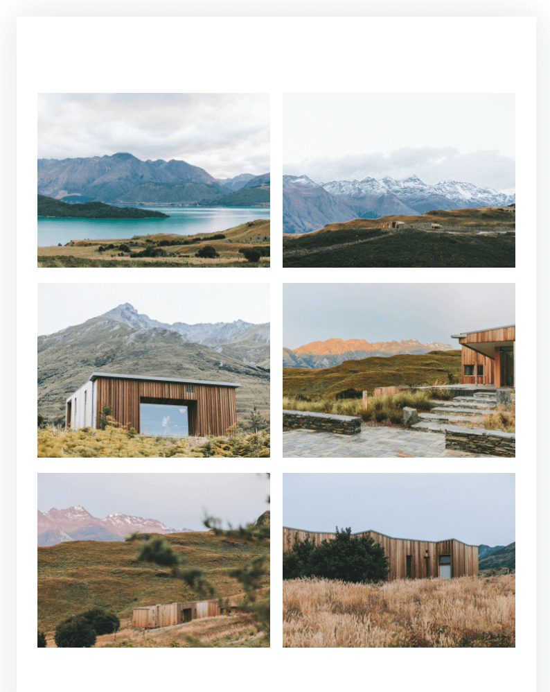
Here’s a desktop view that works:

But view it on mobile and the images are set to display in 2 columns:
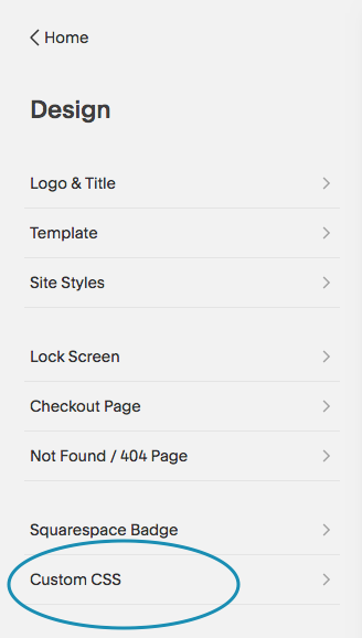
If instead, you’d like these images to stack on mobile, you’ll need to add some code to Design > Custom CSS.
Paste in this code and save it. (For some reason, it doesn’t always show your changes in Squarespace. But if you save the code and view your site on your actual mobile device, you’ll see your images stacked.)
@media screen and (max-width:800px) {
.gallery-grid-wrapper {
    grid-template-columns: repeat(1,1fr) !important;
      grid-row-gap: 3vw !important;
}
}
Now your gallery images should be stacked when viewed on mobile devices. You can adjust the grid-row-gap to increase or decrease the spacing between your images on mobile.
What about Grid: Masonry?
You can also set your Grid:Masonry to stack on mobile, but it’s a little more complex. Squarespace does some behind the scenes calculations in the code, so we have to force a lot more in Custom CSS. Here’s the code for that:
@media (max-width: 800px) {
    .gallery-masonry .gallery-masonry-item img {
        height: 100%!important;
        width: 100%!important;
    }
    .gallery-masonry .gallery-masonry-wrapper {
        columns: 1;
        column-gap: 0;
        padding: 0 10px;
        height: auto!important;
        display: block!important;
     }
    .gallery-masonry-item-wrapper {
        height: auto!important;
    }
    .gallery-masonry-item {
        position: relative!important;
        padding: 10px!important;
        transform: none!important;
        width: 100%!important;
        display: block;
       }
}Squarespace 7.0 - Brine family
The Grid Gallery Block is one of four Squarespace Gallery Block options. It adds a gallery of images and videos to a page or blog post in a symmetrical grid. On mobile, the gallery displays as a grid two columns wide. You can see an example of this here:

But what if you want the images to stack, changing the default grid gallery settings on mobile from being 2 items per line to 1 item per line? (Shoutout to Kelsey in the Squarespace Community Group for asking this question!)

Quick note: If you are looking for a solution for stacking a Grid Gallery on the Pacific Template, you may want to check out my other post specifically for Index page Gallery collections in Pacific.
Changing the Gallery Grid to Stack on Mobile by Default
To change the default Gallery Grid setting for your website so that the images stack on mobile, just add the following code to Custom CSS:
/* stack gallery grid on mobile */

 @media only screen and (max-width: 640px)
  {.sqs-gallery-design-grid-slide {
      width: 100% !important;
      clear: none !important;
  }
  }
If you also want the stacking behavior when you use your phone in landscape mode, or on larger mobile devices, simply increase the max-width above.
Changing the Gallery Grid to Stack on only One Page
If you want to change the Gallery Grid mobile behavior for only one page, that works a bit differently. Instead of using the Custom CSS block, you’ll add slightly different code to the Page Header Code Injection.
In the Pages panel, hover over a page (or index) title, then click the settings icon that appears on the right.

From Page Settings, navigate to the Advanced tab and paste the code below into Page Header Code Injection then click save.

<!-- stack gallery grid on mobile -->
 <style>
 @media only screen and (max-width: 640px)
  {.sqs-gallery-design-grid-slide {
      width: 100% !important;
      clear: none !important;
  }
  }
</style>
Want to stack every grid except for one?
A few people have asked about stacking all their gallery grids except for one, like their instagram feed. Here’s the code you’ll need to paste into Design > Custom CSS. Just replace the block-id with the one you want to exclude. (If you need help finding the block-id, this post shares a Chrome extension that will help.)
/* stack gallery grid on mobile except for one block */
 @media only screen and (max-width: 640px)
  {.gallery-block:not(#block-id-to-exclude) .sqs-gallery-design-grid-slide {
      width: 100% !important;
      clear: none !important;
  }
  }
Note: This code works for Brine family templates (Aria, Basil, Blend, Brine, Burke, Cacao, Clay, Ethan, Fairfield, Feed, Foster, Greenwich, Hatch, Heights, Hunter, Hyde, Impact, Jaunt, Juke, Keene, Kin, Maple, Margot, Marta, Mentor, Mercer, Miller, Mojave, Moksha, Motto, Nueva, Pedro, Polaris, Pursuit, Rally, Rover, Royce, Sofia, Sonny, Sonora, Stella, Thorne, Vow, Wav, West). I haven’t tested on other templates so YMMV.