Three Stylish Hacks for Your Squarespace Website
It’s my pleasure to host fellow Squarespace Circle Member and developer Rachell De Luna on the blog today. Rache offers Squarespace courses as well as tutorials on how to design beautiful Squarespace websites. Today she is sharing three of her favorite hacks to level up the style of your site.
We all know Squarespace is a drag-and-drop website builder, which makes it easier to create and design through templates. But what if you want to make your own site more dynamic and responsive? That’s where the CSS Editor comes in.
No need to panic if you haven’t written a single line of code before, because getting started with this feature is simpler than you think. Here are three popular Squarespace hacks that will come in handy for you:
1. Learn CSS Basics

It’s best for you to begin with the creative foundation when it comes to adding custom code. CSS, which stands for Cascading Style Sheets, is the programming language that we use to style web pages in ways that the Site Styles settings cannot.
These are just some of the benefits of using CSS for Squarespace designs:
Solves layout issues. CSS allows me to address alignment and spacing problems without relying on spacer blocks.
Creates flexible & beautiful mobile sites. It can make your site more responsive overall, and you’ll be able to move elements easily.
Makes the site easier to update. Without CSS, your clients would be too dependent on editing programs to clip or mask images when needed.
Boosts your SEO. When you post important headings as images in your site just to go for a certain aesthetic, you’re going to miss out on SEO keywords.
Creates more elevated sites. It’s important for your website to reflect your brand’s personality, and CSS would make it easier to do just that.
I’ve created a free foundational course that you might want to check out here. It’s a project-based approach to learning the syntax and best practices, and you’ll even be able to overlap images and transform blocks by the time you finish.
2. Add Mega Menus
Through CSS, you’ll be able to make your navigation bar stand out in two ways: an elegant multi-level menu and a pop-out menu. Both features will allow you to add any block you need, like summary blocks, newsletter blocks, and subscribe forms.
You can take inspiration from stylish examples like the Home Studio List. This feature allows you to list down categories for e-commerce sites or to highlight important sections of the page and make them easily accessible via the header navigation.
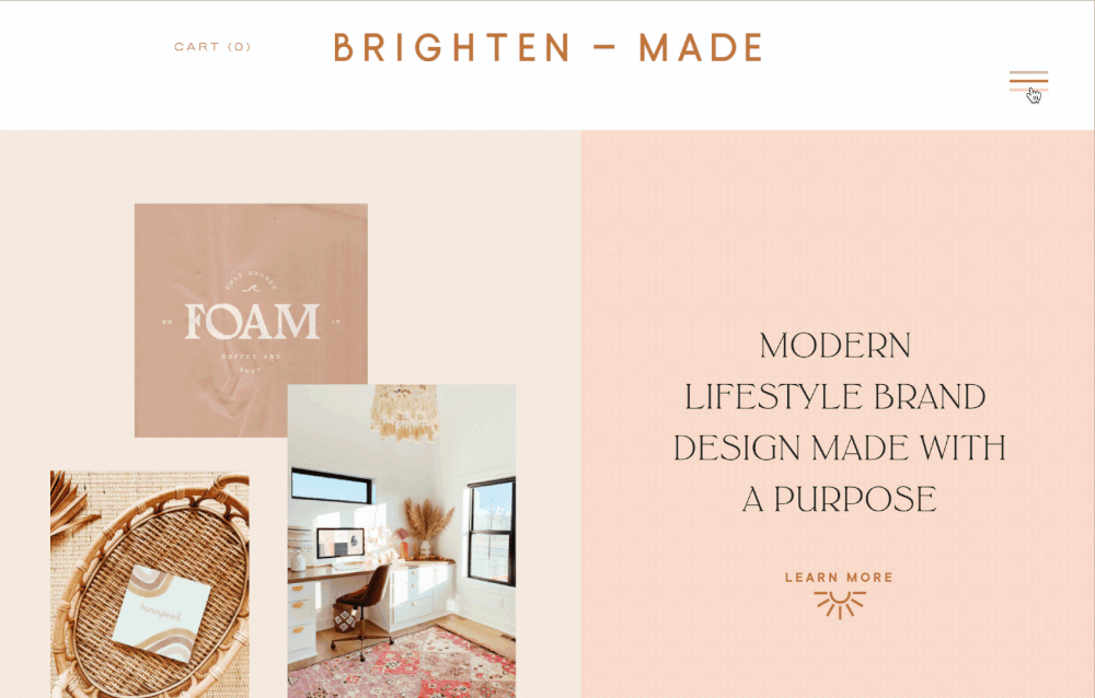
The Brighten Made website used the Pop-out mega menu. This feature allows you to add text elements, images, galleries and even summary blocks right at the pop-out menu.
The Louise Crozier website also features a simpler application of this hack.
Learn more about my Flexible Mega Menu course and view the demo here.
3. Add Sticky Scrolling Sections

Are you digging the cool scrolling effect where one side stays put while the other scrolls down? That’s also possible with a little custom code. In applying this design, you’d still be able to add widescreen sections above and below your split sections, as well as stack multiple scrolling sections.
Some striking uses of this feature include The Lab of Meditation by Pop Brand Co.
See how you can create all these and more in my Fixed Split Section course here.
