Fluid Engine - Squarespace 7.1 walkthrough
In July, 2022, Squarespace rolled out a new page editor called Fluid Engine.
This change is happening on all Squarespace 7.1 websites. (If you're on Squarespace 7.0 or earlier, you'll continue to use classic editor.) If you haven't seen it yet, the next time that you start a new template or create a new page or section, it will automatically be created in Fluid Engine.
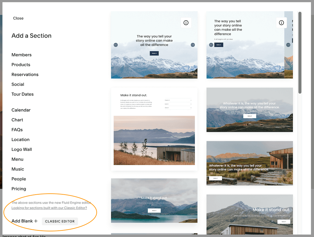
In this post, I’ll walk you through the basics of how Fluid Engine works. And I’ll show you how you can still (for now) access classic editor sections.
Fluid Engine exists on Pages where you can add sections on Squarespace 7.1 - you won’t see it on Blogs or Product Pages. At least not yet.
Gallery sections and List (“Auto Layout”) sections still work the same for now too.
Fluid Engine Updates
November 2022
<option> + drag now duplicates blocks in addition to using keyboard shortcuts or the duplicate icon
September 2022
block duplication: click the duplication icon (or use command + D on your keyboard) to duplicate a block; you can also select multiple blocks and duplicate them all at once
select all blocks in a section (command + A)
copy and paste blocks within or across sections (command + C and command + V)
August 2022
mobile row height is now more consistent across device widths; this will prevent large unwanted spacing at wider mobile sizes
if you drag a block near the dotted blue center line, an orange line now appears to confirm that the block is centered; if the block you are dragging happens to be an odd number of columns wide, the block will grow by one column to make centering possible without having to take multiple actions
up/down arrows now appear on elements in mobile view so you can reorder them more easily
July 2022
added the ability to group elements (July 21)
new pre-made page and section layouts rolled out for Fluid Engine (July 21)
editing section height and alignment using the Viewport toggle is now called Fill Screen (July 31)
When hovering over a block on a 7.1 Fluid Engine site using Mobile View, you can now select Move Up or Move Down arrow icons to rearrange content without having to click and drag (July 31)
Video Walkthrough
Squarespace Fluid Engine vs. Classic Editor
✨ Element Interaction & Grid
Classic Editor: Elements impact other elements’ size and/or location, uses a 12-column grid.
Fluid Engine: Elements have no impact on each other’s position or size, uses a 24-column grid.
One of the big changes is that with Classic Editor, you had a 12-column grid and you would use spacer blocks to position things. Whenever you moved an element, that change impacted the placement or size of other elements. For example, if you added a third image in a row, the sizes of the other images in that row would decrease to accommodate the new block in the grid.
That’s not the case for Fluid Engine - elements don't influence one another. We now have a 24-column grid in which we can edit the amount of space between grid cells, and you can put any block anywhere on that grid.
☀️ Interface
Classic Editor: Sections come with a default text block and insertion points. Section Format is simple.
Fluid Engine: No default blocks. Add Blocks button at top left of section. Section Format has many more options.
With Fluid Engine, you can manually adjust row count (how tall your “artboard” is on the page, as well as how compact or spacious the grid spacing will be. Instead of using insertion points around other blocks, there is an Add Block option in the upper left of the section.
🔥 New Feature - Block Background
For both Classic Editor on FE-Enabled sites and Fluid Editor sections, text blocks (and many other block types) now have an option to add a background color and rounded corners.
🤗 Overlapping Blocks
Classic Editor: required CSS
Fluid Engine: no code needed
If you’ve ever used overlapping images in a design, until now you had to rely on Custom CSS or creating the visual in another program and loading it as one image into Squarespace. Now you can overlap and overlay any kind of block, adjusting each block’s forward or back position.
I used to rely on code to create “split screen” designs, but now you can do that without any code at all. Toggle off Fill Screen in the Section Format tool, then drop in an image block, set it to Fill, and drag it to cover half of your screen.
📱 Edit Mobile View Separately
Classic Editor: mobile responsive
Fluid Engine: design mobile view separately
With Fluid Engine, you have the ability to edit separately on mobile. For mobile, Fluid Engine stacks the blocks in the order they were added to the section and you’ll go into Mobile View and arrange them there. At the moment, you can’t toggle off specific mobile elements, but my trick is to put some elements behind others to “hide” them if you want a cleaner look on mobile.
🚫 Not ready for change?
Good news! You can still add Classic Editor sections to your 7.1 website. This gives you an opportunity to keep building your site and making changes quickly before having to commit fully to Fluid Engine. When you click to add a new section, scroll all the way to the bottom left of the selections and you’ll see an option to add a Blank Classic Editor Section.
✅ Ready to dive in?
If you are on Squarespace 7.1, whenever you add a new page or a new section (unless you use the step above), you’ll be working with Fluid Engine.
If you want to convert existing Classic Editor sections to Fluid Engine, you can do that too! Edit any page and roll over a Classic Editor section and you’ll see an Upgrade button. Click that and your section will be transformed into Fluid Engine! But once you click, there’s no going back.
My advice is to create a new password-protected page to play around with Fluid Engine until you are comfortable using it on your life pages.
💥 More Resources
You can check out the official Squarespace Fluid Engine support info.
Fast Company recently interviewed Squarespace Founder Anthony Casalena and they share “…the fundamental idea for such a major overhaul was to make web design more accessible for those who don’t know a thing about it—and more efficient for those who do.”


