Squarespace NEW FEATURES roundup - October 2021
Since their IPO in May, Squarespace has been very busy rolling out new features. This month is a humdinger of new settings (and a new block type!) so I wanted to round all those up here so you can play with them on your own site. And if you used captions as alt text (as was best practice), you have some work cut out for you now. Let’s start with that new block type…
Accordion Block
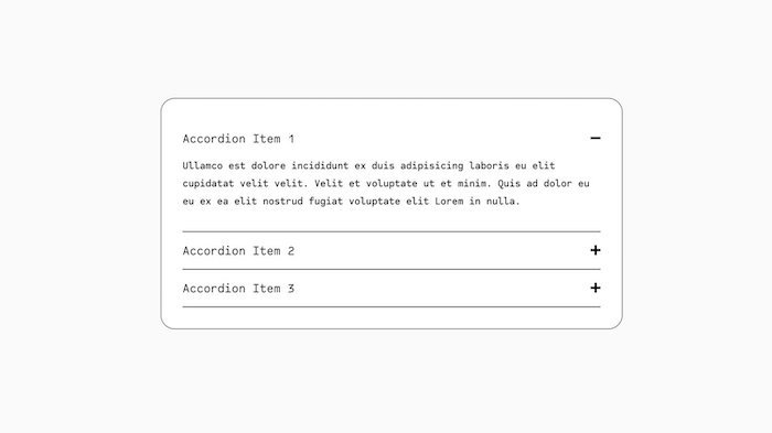
This one is pure gold! Until now, if you’ve wanted to add a dropdown FAQ section or any kind of accordion, you had to use a third-party Squarespace plugin.
To add the Accordion Block, edit your page and click a blue + icon to add a new block, then scroll to the end of the Basic block listing OR start typing accordion. After adding the accordion block to your site, under the Content tab you can add the title (question) and description (answer) for each item. Once your content is in place, you have several styling options under the Design tab:
change the style of the Title and Description text (default is Heading 4 and Paragraph 2)
toggle to expand the first item
toggle to allow multiple items open at once, as opposed to closing an item when a new one is opened
show or hide the divider as well as change its position and opacity
choose your icon: plus or arrow, then style its size, thickness, and position
customize the padding between rows
Here’s an example of the new Squarespace Accordion Block:
-
Description text goes here
-
Description text goes here
-
Description text goes here
If you’d like more customization options, Ghost Plugins just released a free Accordion Block Style plugin (and, knowing the Ghost team, I bet more are on the way).
At the moment, you can’t add anything other than text to the accordion block, so if you want to include images or videos, you’ll want to use a plugin like the Accordion Tabs Plugin from SQSP Themes.
Image Shapes
Not long ago, Squarespace rolled out the ability to round the corners on images. They’ve taken that to a whole new level now with image masks and there are a LOT of them. Some are things I can imagine using, but others are… odd choices might be a good way to put it. If you do use these on your own site, I’d recommend choosing just one or two styles and sticking with those.
Note: this feature rolled out with some bugs. I would love to use the circle mask on an image card, but it doesn’t work at the moment (it’s more like a very flat oval). Squarespace is escalating the issue, so fingers crossed they fix it soon.
Here are some of the new Image Shapes:
When you add an image block, under the Design tab, instead of Original click on Shape, then click on the Shape > menu that appears underneath. Choose your aspect ratio and then pick one of the image mask options. Applying a shape doesn’t affect your original image, so you can have fun playing around and know that you can put things back to normal easily.
Image Alt Text
Alt text is text added to an image to make it more accessible. If the image display, or someone is using a screen reader, they will see alt text so they understand what was in the missing image. Importantly, search engines also use alt text to learn about the image, so it’s a great place to work in your keywords. You’ll want to keep alt text fairly short, typically 12 words or fewer, use real sentences/words without hyphens, and describe your image well.
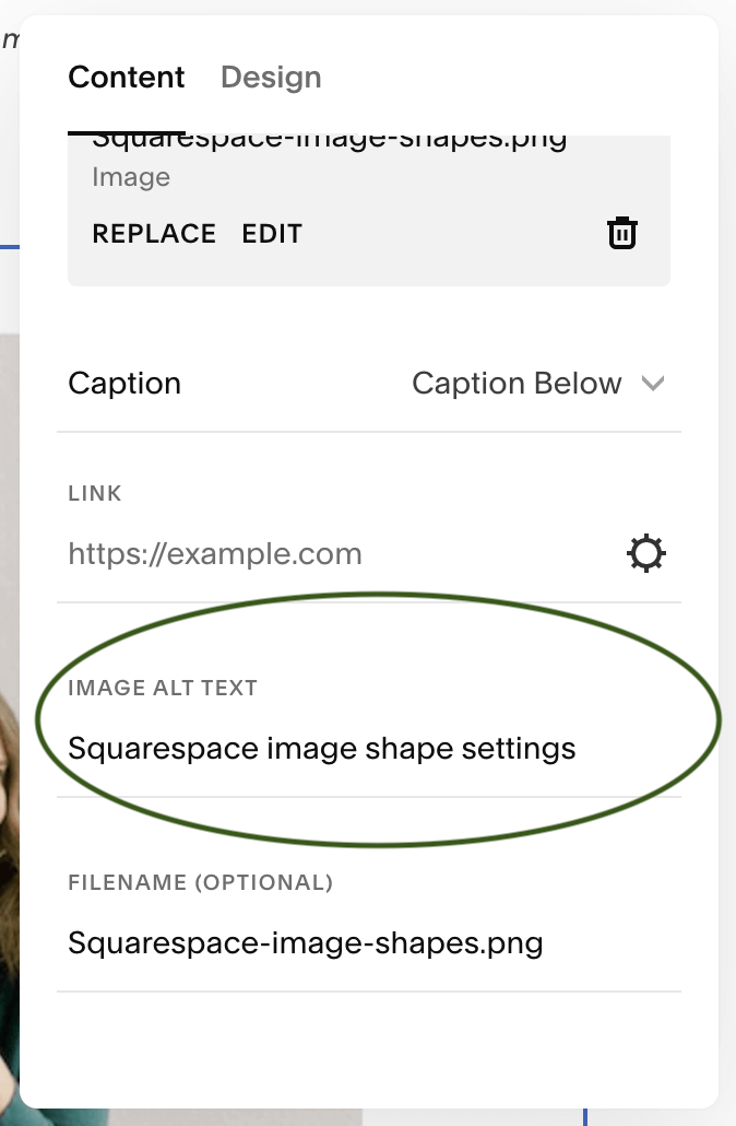
Until now, to add alt text in Squarespace, you had to add it in the image caption (not ideal) and then hide the caption if you didn’t want it visible on the site. A wonky effort and extra work. Thankfully, Squarespace has added an IMAGE ALT TEXT field to the image block under the Content tab. Scroll down under the image file and caption to find the new field.
Note: If you were using the caption method (which was the correct way to do this before), your captions are NO LONGER alt text for some images - specifically, image blocks that were not inline style. Instead, the image file name will be pulled for alt text. Yes, this is a bummer. And yes, I’ll be going through my website and updating my image alt text one by one.
Media Library Asset Deletion
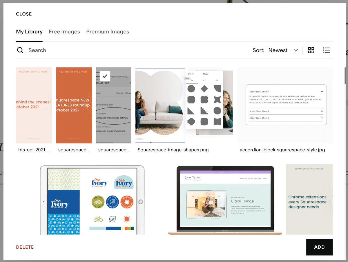
If, like me, you try out a few (hundred) images before settling on the right one, this new feature is for you! In your Media Library, you can now delete assets. Select any image in your library by clicking it and then click the red DELETE in the bottom left of the window.
A word of caution here. If you delete an image that is used on your site, it will remove that image from your website. When you select an image it will let you know if it’s NOT used on the site and safe to delete. Deleting an image is permanent and you can’t get it back within Squarespace once it’s gone.
Header Styles (Squarespace 7.1 Only)
The new Header Styles allow you to add drop shadows and gradient backgrounds, as well as blur backgrounds, and add borders. You can find header styles by clicking Edit Site Header and then Style. I’ve played with these and they only appear to work if you have the “transparent” setting turned on so that your header overlays your first section and so far they are pretty glitchy. This makes sense for the blur, but it annoys me that I can’t use the new borders (the only thing I think I’d want to use here) on my 7.1 website.
I’m also not thrilled with this addition in general. We designers have been asking for additional header layouts (like we had in Squarespace 7.0) but we got this instead? I think some of these styles could be nice if used in very specific ways, but I worry that adding these options plus the image shapes plus site animations are just giving us too much flexibility. I fear that we’ll start seeing more and more Frankenstein-type sites that are trying to use all the features, just because they can. That said, I’m excited to see what some of the Squarespace designers who push boundaries come up with!
Blank Template
Speaking of Squarespace designers, we now have a BLANK TEMPLATE option when we start a new site. I’ve used this quite a bit recently and it’s a major timesaver to not have to delete out all the pages and demo content in other templates. You get one blank page and no demo content… a true blank canvas.


