How to write easy to read web copy - using this one simple trick!
I’m delighted to host fellow Squarespace Circle Member Luciana Diehl on the blog today. We met on Instagram and share a love of both Squarespace and chocolate. Luciana posts helpful tips on her instagram feed @lucianadiehldesign and it’s a pleasure to have her share one of her most popular posts here:
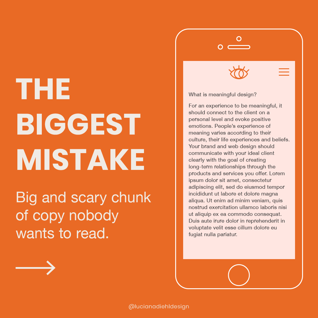
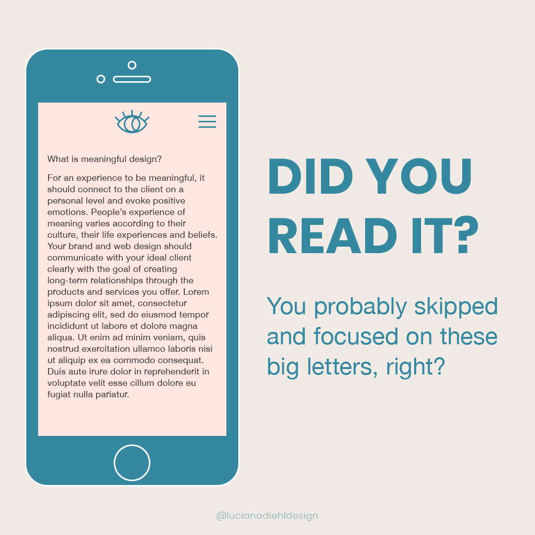
One of the most common mistakes I see when auditing a website is - because it is so obvious - a lack of visual hierarchy! Creating visual hierarchy is one of my favorite tips to give.
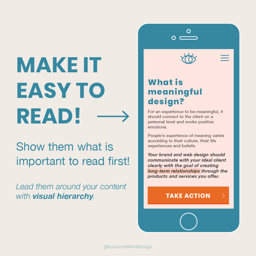
Your web visitors are looking for information fast and they make quick decisions without thinking. Make your site easy to read by showing them what is important to read first.
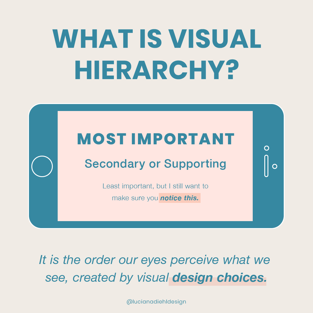
Hierarchy makes things organized.
It means arranging elements according to their importance. In design, hierarchy creates a visual organization. It gives the reader an idea of where to begin and finish reading.
Clients often ask to increase the size of all the elements on the page as they feel everything is very important, but the problem is that by making everything stand out, nothing stands out!
The entire content might be important, yes, but there is usually an attention grabber word or a line sentence that should stand out the most to lead the audience into the rest of the content.
Review your web copy and ask yourself:
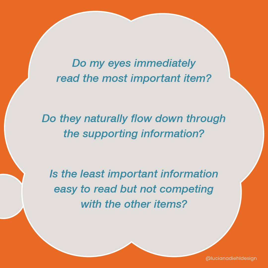
Do my eyes immediately read the foremost important item?
Do my eyes naturally want to read the supporting information?
Is the least important information easy to read but not at all competing with any of the other copy elements?
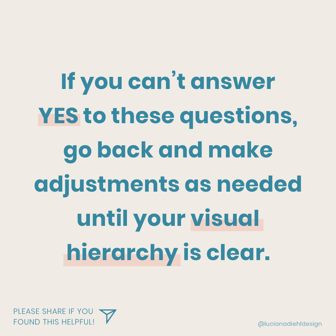
If you can’t answer YES to the questions above, go back and make adjustments as needed until your information is engaging and easy to digest, meaning your content visual hierarchy is on point!
