Custom CSS Every Squarespace 7.1 Website Needs
There are two pieces of custom CSS I add to almost every Squarespace website I build. To add these code snippets, navigate to Custom CSS, paste the code into the box and hit save. The image examples below are from my SWAY template.
Move Header Social Icons Closer in Squarespace
This is something that drives me batty. When you include social links in your website header along with your navigation, they are spaced apart based on your navigation links spacing. What works for words, doesn’t really work for icons, though, and I like to hug the icons a little closer together so they look cohesive. Here’s the code I use. It maintains the spacing for the first icon, then just scoots the others closer so they don’t look adrift. Is it a huge difference? No. Is it an important one? I think so.
/* move header social icons closer */
.header-actions--right .header-actions-action--social .icon:not(:first-child) {
    margin-left: .6vw;
}
Change Default Heading Margins in Squarespace
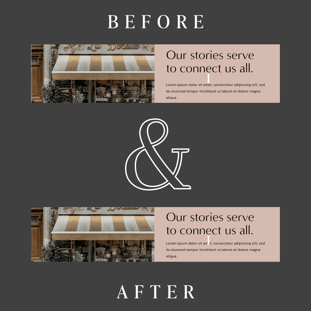
By default, Squarespace adds a lot of extra space under your H1-H4 headings and I don’t love it. I change that margin to be the root font size that you’re using (usually it’s 16px, but this scales accordingly. You’ll see a bigger difference with larger text. In the example, the H1 before was floating WAY above the paragraph text. After adding CSS, it looks like it’s part of the same text block.
/* change default heading margin */
h1, h2, h3, h4 {
  margin-bottom: 1rem;
}
Those are two Custom CSS snippets I use on almost every site I develop. I hope you find them useful!


