7 Ways to Style Squarespace Summary Blocks
Say that 10 times fast… then keep reading to learn more about how I use summary blocks, or scroll on down to get the goods. Then keep reading for some free CSS snippets to style your summary block images and a complete video walkthrough of the Summary Block.
The Squarespace Summary Block
One of my favorite blocks in Squarespace is the Summary Block. I use it on almost every website I build. I most often use it to showcase recent blog posts on home pages, but it is incredibly useful for highlighting blog posts, products, or events anywhere on your site.
In the Summary Block settings, you can choose which items to display by setting the collection (a particular blog, shop, etc) and then getting even more granular filtering by categories, tags, or featured status.
Check out the video walkthrough of the Squarespace Summary Block at the end of this post. ↓
If you have a commerce store on Squarespace you could, for example, showcase your Christmas products on your homepage when that shopping season begins, then with just one quick category change, transition over to products for the new year.
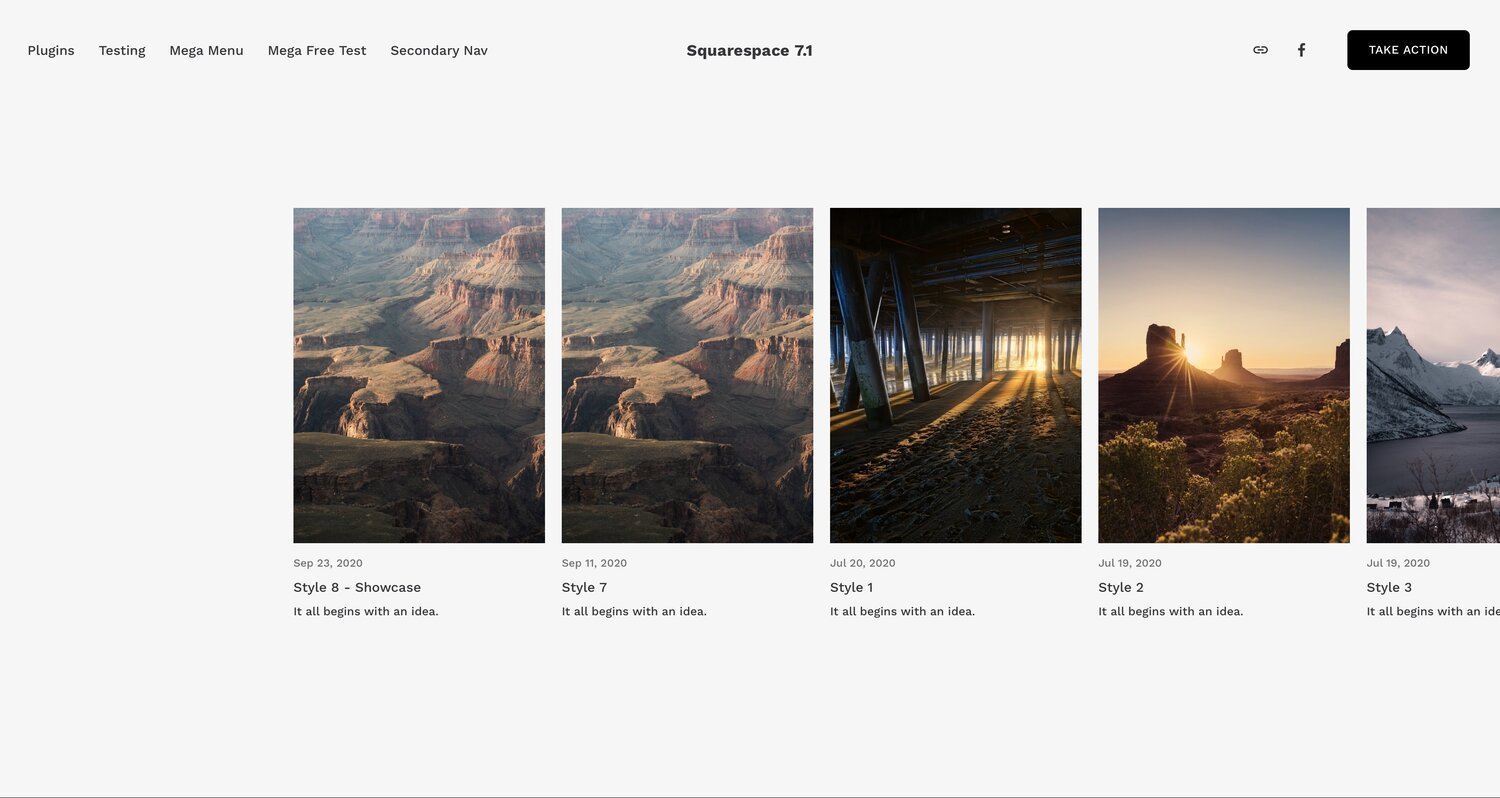
Another great use case is to add a Summary Block on top of your Blog page or on your Squarespace Blog Sidebar to highlight your most popular blog posts. You could also highlight posts or shop items on a Thank You page after someone fills out a form. Or include them inside another blog post, like this:
See what I did there?
On my site, I don’t do any special styling of the summary blocks. But for client sites, I’m always on the lookout for something to make their summary blocks look a little more stylish. For my last client build, I looked into different ways to style the Summary Block using custom CSS or plugins.
Here are some of my favorite ways to Style Squarespace Summary Blocks:
1. Balance Summary Block - Ghost Plugins
Create balance with this simple summary block style that allows you to set the number of items (1, 2, or 3) shown per row.
Uses a nifty image zoom effect on image hover and outlines each item with curved borders.
Works with Squarespace 7.1 / $50
→ In fact, Ghost Plugins has several gorgeous Squarespace Summary Block styles…
Ghost Plugins offers both Super Plugins for a fee and Free Plugins. You’ll see a few more faves from Ghost here, but they have a TON on their site.
2. Overflow Carousel Items - Will Myers
Have your carousel items scroll in from the side of the page to give it a nice overflow effect.
Works with Squarespace 7.1 and Brine Family Squarespace 7.0 / $20
3. Lazy Summaries - Squarewebsites
This is more of a function than style option, but it’s so useful I wanted to include it here. The Lazy Summaries plugin raises the limit on summary blocks from 30 items to unlimited items and some additional features for different display settings for pagination and for mobile view.
This plugin is included with their PRO extension, but you can also buy it as a standalone product.
Works with Squarespace 7.0 and 7.1 / $55
4. Simple Overlay - Beatriz Caraballo
Beatriz has a code walkthrough showing you how to add an overlay to your summary block thumbnails.
This adds text and a semi-transparent background to the summary thumbnails so they pop up on hover.
Works with Squarespace 7.0 and 7.1 / FREE
5. Damn Beautiful Summary Block - Ghost Plugins
Adds a background, drop shadow, and stylized gradient button to level up your summary block style.
Works with Squarespace 7.0 and 7.1 / FREE
6. Hayton Summary Block - Ghost Plugins
Summary block restyle with a unique and image-focused hover effect – perfect for linking to projects and case studies.
Works with Squarespace 7.1 / $50
7. Custom CSS to round the image corners
Sometimes just a little touch is enough. Add this code to Custom CSS to round the corners for your summary block images. You can adjust the border radius values to change each corner for a totally custom look.
/* round image corners summary blocks */
.sqs-block-summary-v2 .summary-thumbnail {
  border-radius: 20px 20px 20px 20px;
}
Want to carry that styling through for your blog page as well? You can use this code to round the image corners of your blog thumbnails. This works if you are using the grid layout in Squarespace 7.1:
/* round image corners blog thumbnails */
.blog-basic-grid .image-wrapper {
  border-radius: 20px 20px 20px 20px;
}
Video walkthrough of the built-in Squarespace Summary Block settings and design options:
We’ll look at the different content and design options of the summary block. You’ll learn how to adjust the layout of the summary block and get rid of that annoying “featured” text that can appear on top.


